

Branding the intersection of design and technology
The brand position aimed to convey motion and an aggressive but modern atheistic. Three other components to establish were digital, problem solving, and efficiency.
Re-imagining the meaning of digital – the pixel, the poly and the control point
Let's face it digital is overplayed. Its usually a pixel, and now a polygon. There is something to be said about established metaphors, so I wanted to see how I could bring a different perspective. It was staring me in the face everyday. I got inspiration from the control points we designers use to manipulate 2D and even 3D objects.
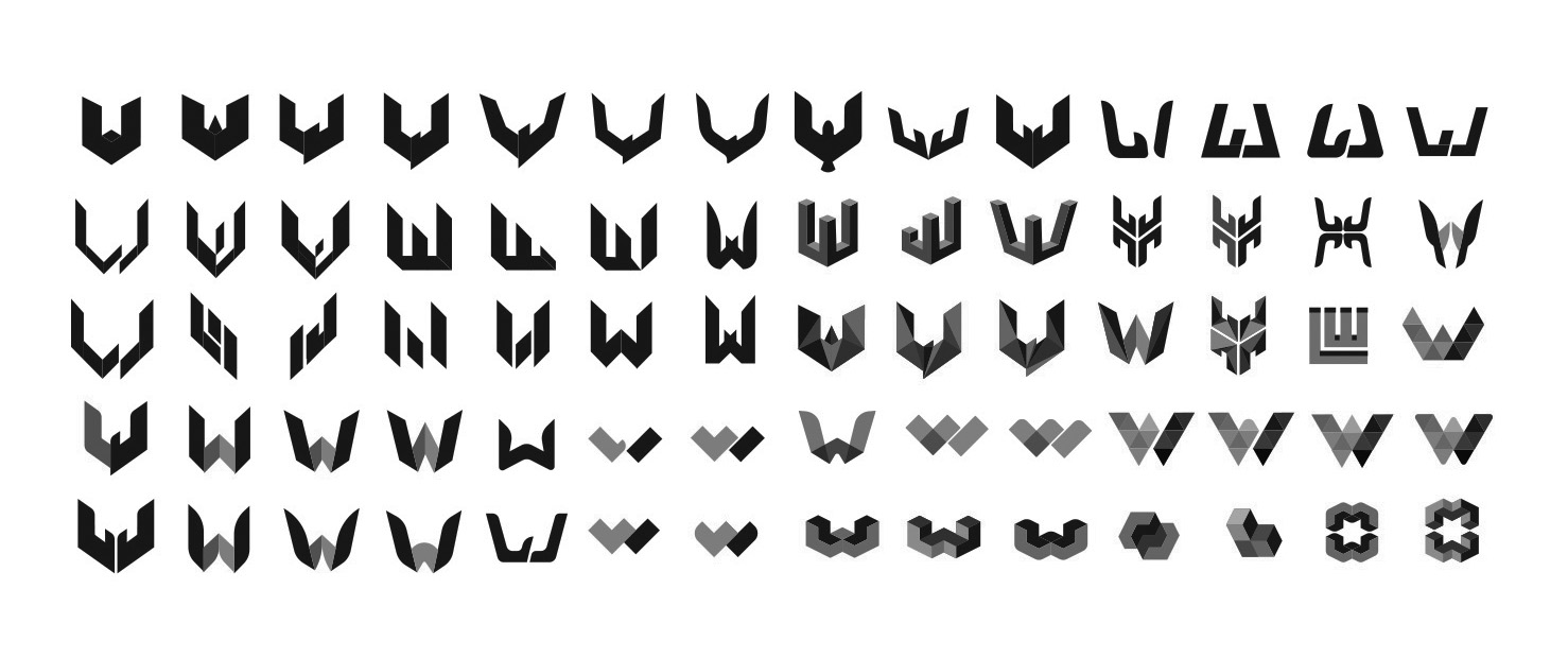
The journey of logo iteration, failure, and eventually success
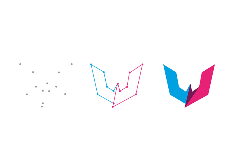
Problem solving with the straightest path
Using control points let me create a metaphor to problem solving, which in turn helped create the rules that govern the logo's design, no curves. In the end the logo conveys a bird in motion, and an "L&W" crashing into one another. We have design on one side, and technology on the other.
Using the semantics of the visual language to enable storytelling


Local Wisdom Website
Local Wisdom is a digital design agency with a technology edge. I was responsible for the direction and design of the branding, position and all collateral such as the website.
Additional Logos


